VP of Brand & Creative: John Schreiber
Matthew's Sr. Director of Culture & People Strategies: Ann Wilson
Services Rendered: Art Direction, Branding, Graphic Design, Creative Strategy, Web Design, Environmental Design
A Global Leader in Fulfillment
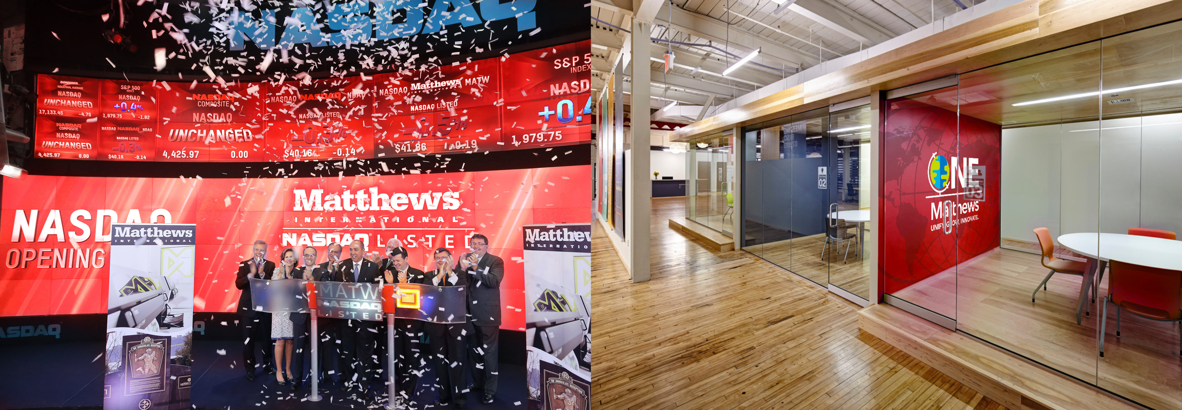
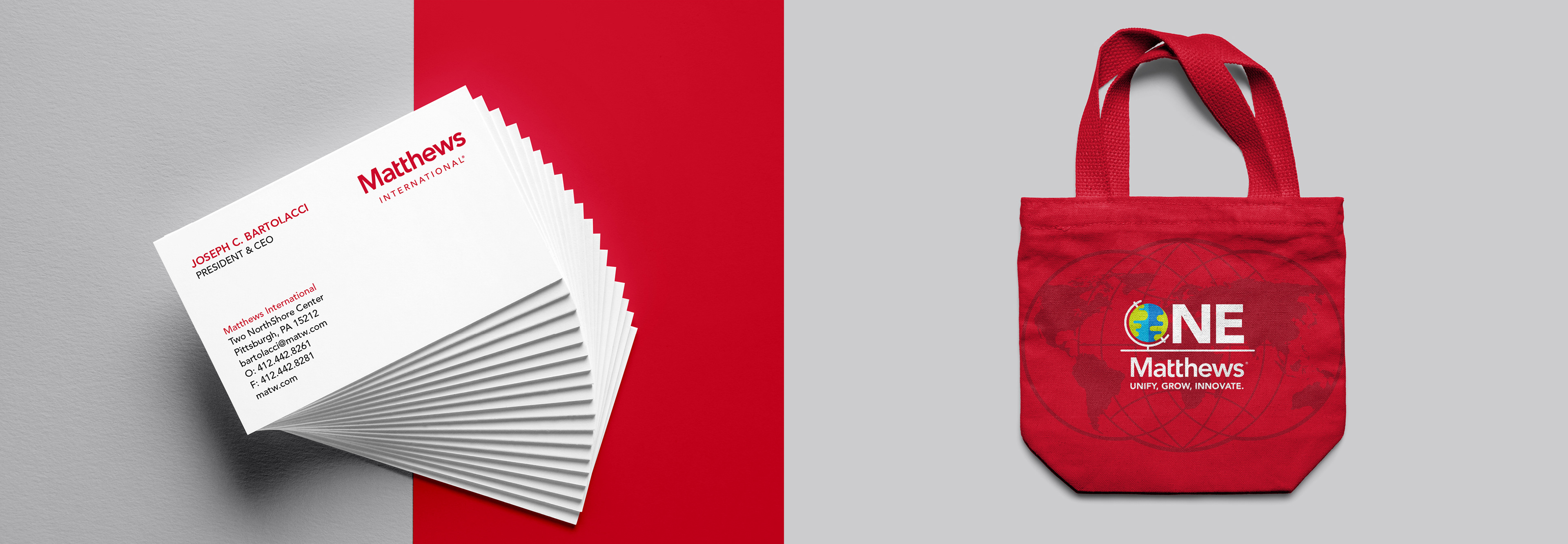
Matthews' acquisition of SGK marked the beginning of what would become a long-term plan for creating a unified corporate culture and identity, the ONE Matthews initiative.
It wasn't enough for Matthews to just own SGK and the other companies it acquired, it was paramount to the company's lasting success that leadership and employees embraced a culture that highlighted individuality but was rooted in unity.

Objective
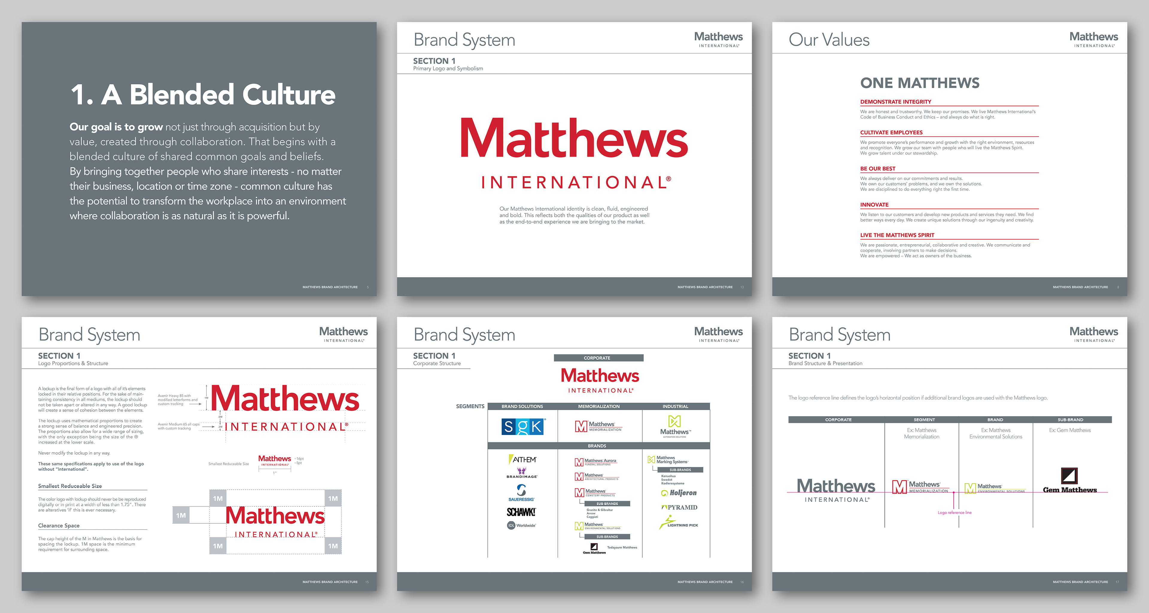
Over the course of 30 months, I was tasked to use strategic communication, unified visuals, and a logistical communication infrastructure to develop a brand architecture that would dictate the visual style of Matthews corporate as well as all 17 sub-brands in its three global business segments.
My ultimate goal was to use design to unify the Matthews messaging and visuals to assist in a smooth transition for the newly acquired companies. This was a massive undertaking that required close communication with the Matthews Cultural Change Management Team as well as coordination with corporate teams in other countries.


Development
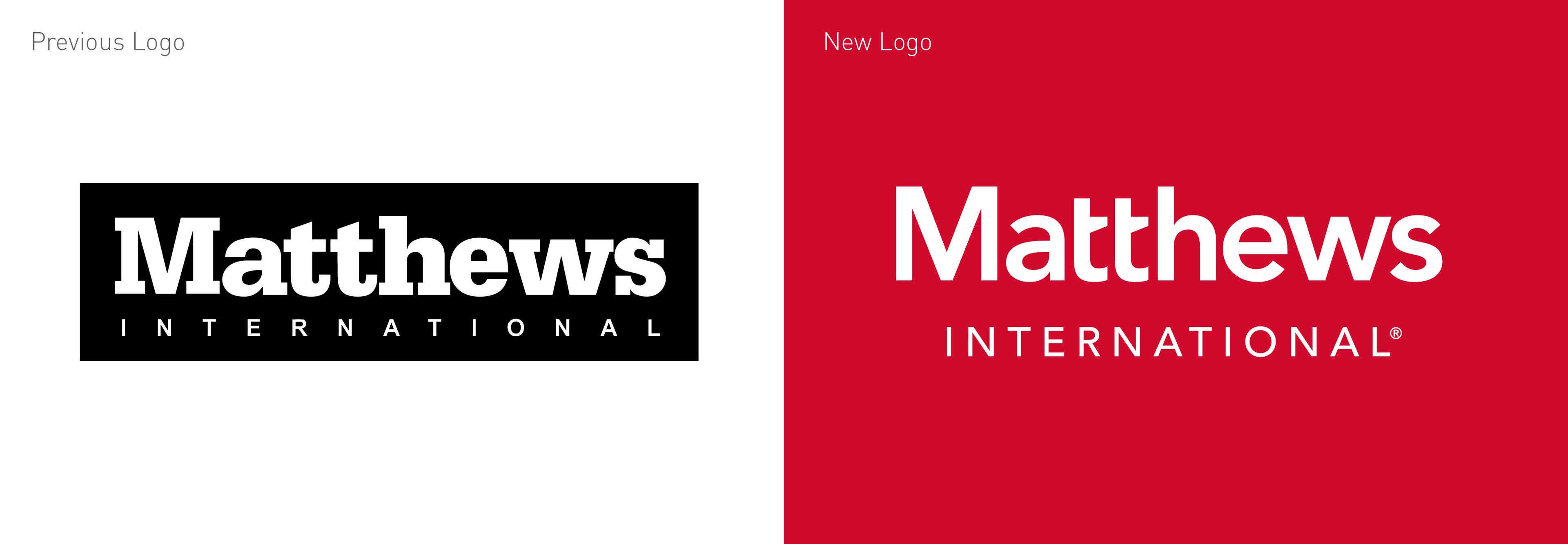
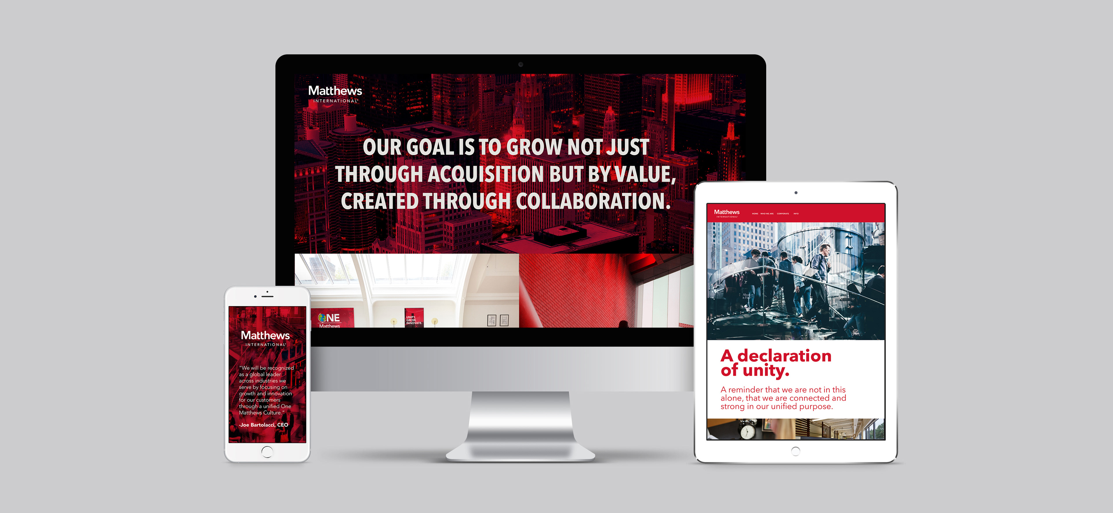
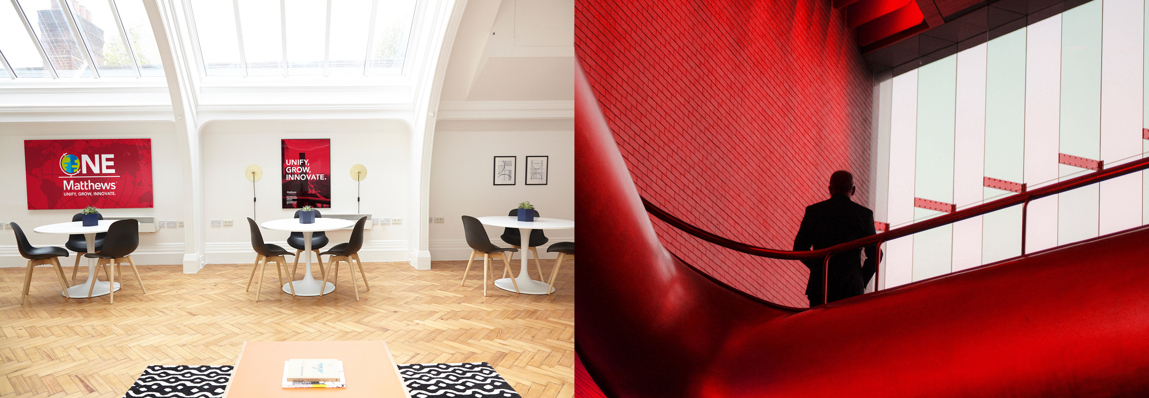
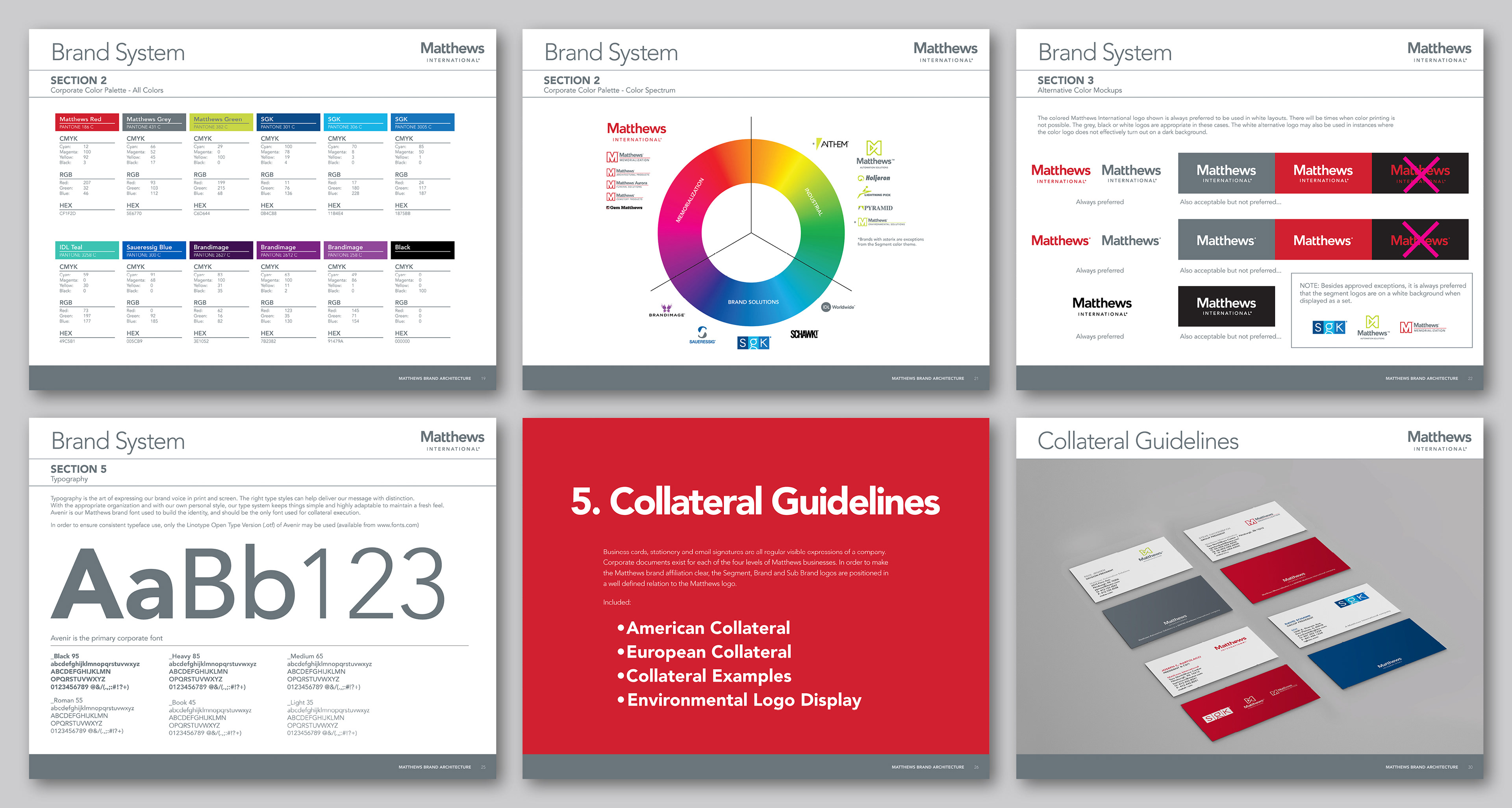
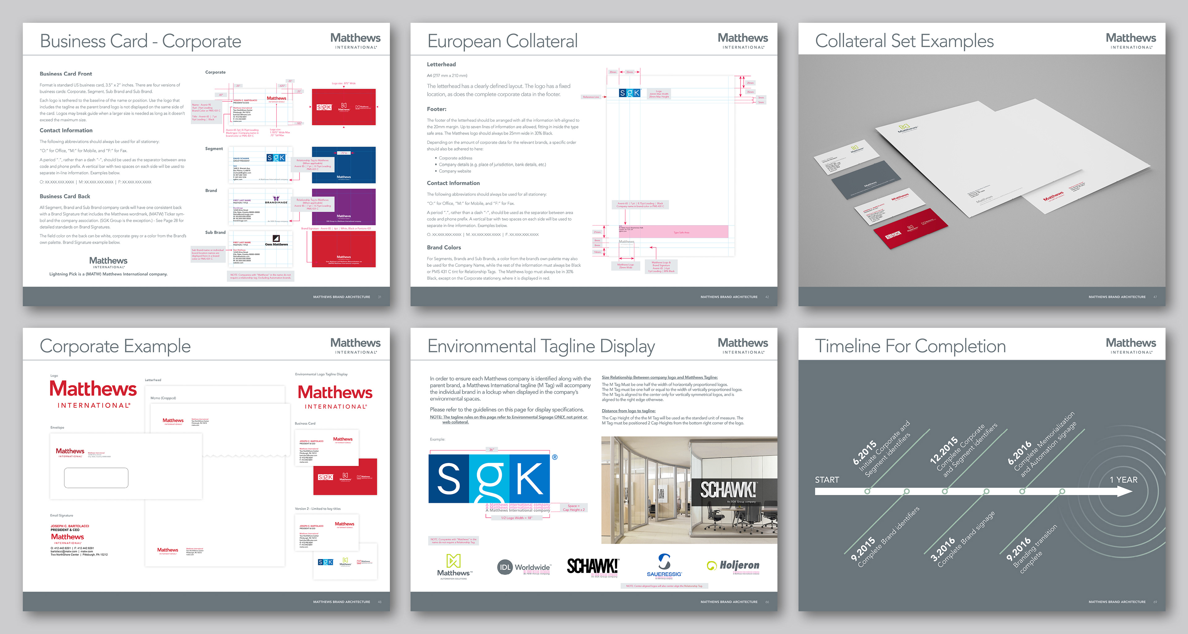
The project consisted of updating the logotype through the application of fresher, more modern typeface, a brighter corporate color, and the development of extensive brand guidelines that included European brand standards. This resulted in creation of a rich graphic universe, as well as its application to a series of pieces that include everything from printed materials to graphic advertising, the corporate website, all brand and sub brand collateral, physical spaces, merchandising, etc.

Transitional Brand Development
Before the public merger announcement, things had to be kept under wraps tightly. However, since acquisitions can make some people nervous about the stability of their work, the Matthews leadership desired to begin the transition to a ONE Matthews culture and corporate rebrand slowly to ensure buy-in at every level of the business.
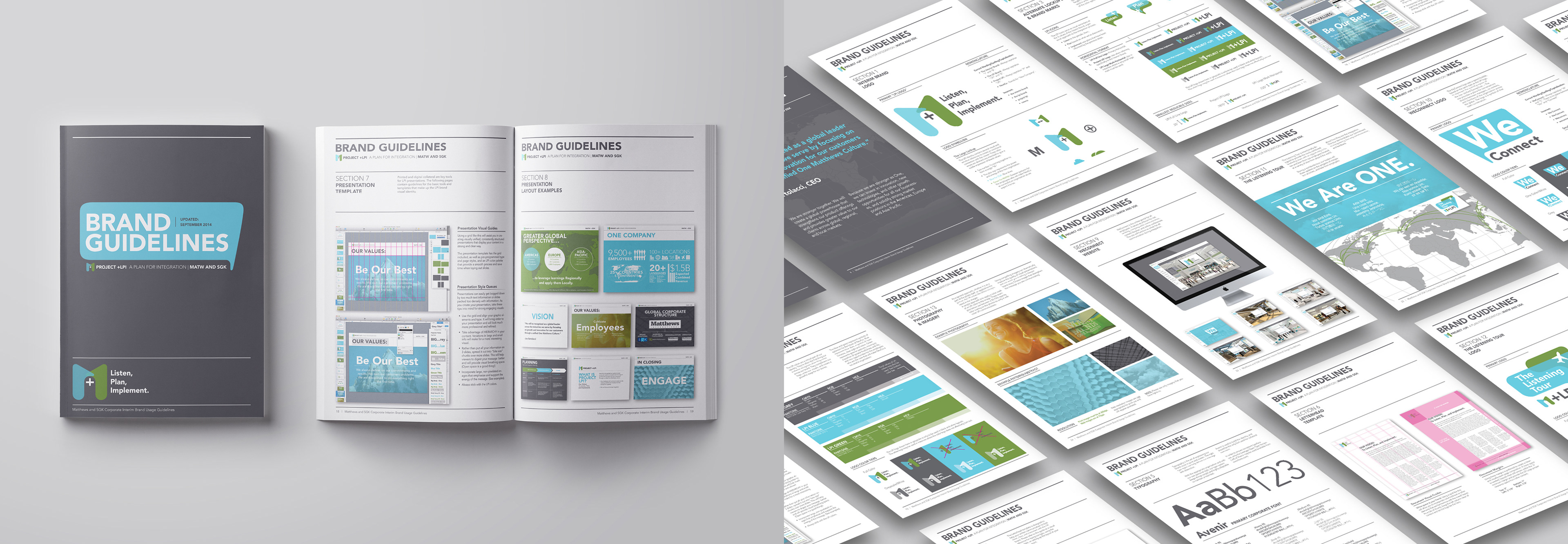
I was asked to lead design for the team that was responsible for developing a transitional internal brand for Matthews that would be used in the interim before the official transition. The goal of this transitional brand was to LISTEN to the pulse of the corporate culture, PLAN solutions based on their findings, and IMPLEMENT strategic action to address concerns and unique situations resulting from the big corporate change. – It was officially called Project+LPI.
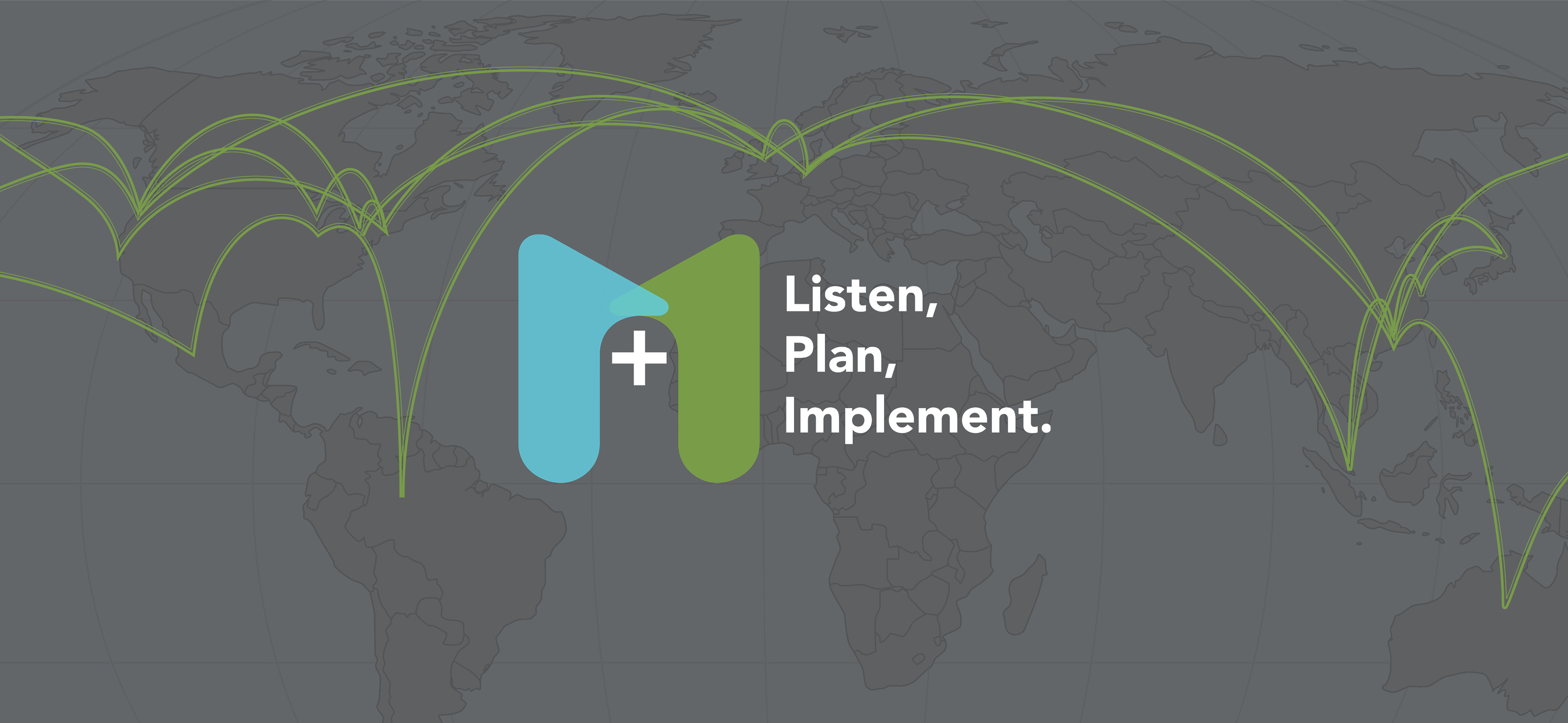
I designed the logo for Project+LPI, which was purposely meant to look more like an internal initiative rather than a new corporate brand to avoid shocking anyone with an abrupt shift.
The logo utilized strategic symbolism: Two number 1’s coming together to form a single “M.” The plus sign represents the power and energy of the new organization. Blue for SGK: "Blue skies", Green for MATW (from the expanded color palette): "Greener pastures" for the employees who will make the new company a successful organization.
Project+LPI included two primary elements:
The Listening Tour, where leading members of the company would tour around the globe, visiting numerous locations of Matthews companies explaining the upcoming transition and how it affected them as well as answering questions and promoting the benefits of the new change.
The second element of Project+LPI was the WeConnect Web Portal, which was an online resource designed to provide information about the transition, message boards for employees to communicate amongst each other through the change, as well as direct access to leadership for asking questions and proposing ideas. A third-party company had already been contracted to design the WeConnect portal, but I was brought in to consult, design the logo, and develop a style guideline for the existing site.

Human Resources Rebranding
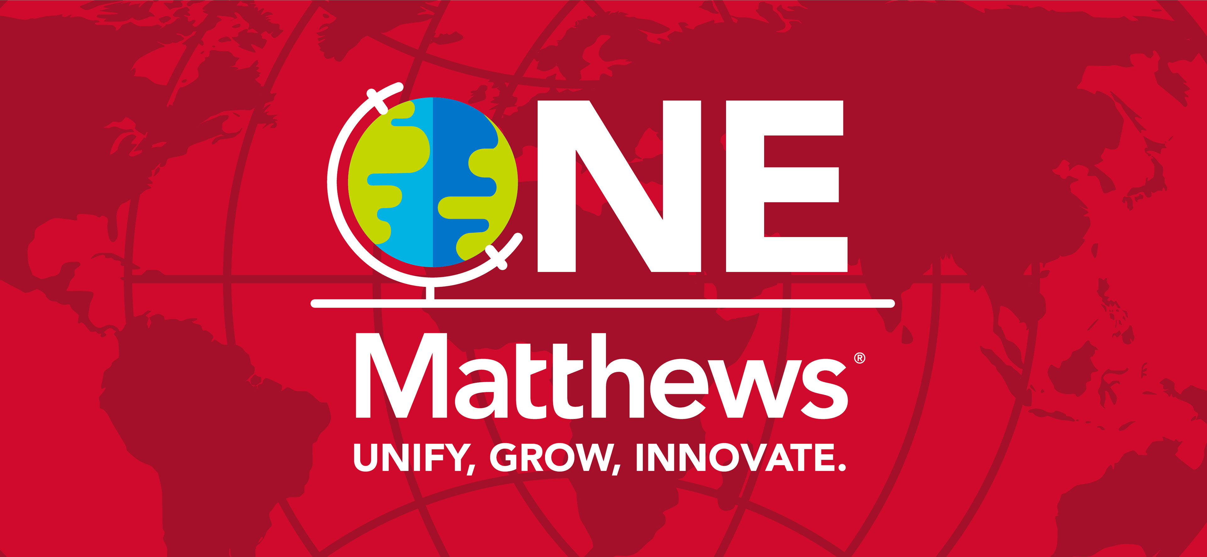
Throughout the massive corporate rebrand, I worked closely with Matthews' Director of Cultural Change Management. Following the success of our work together on the transitional brand and merger, I was invited to redesign the internal HR brand to reflect the overall brand refresh. This was officially called the ONE Matthews Initiative, and it hinged specifically on the HR department's ability to create a culture of unity throughout the newly acquired companies and existing companies.
I developed a refreshed logo for the ONE Matthews Initiative, a full set of over 150 icons, a unified color palette that merged both Matthews and SGK colors, as well as a comprehensive Visual Communications Toolkit for the HR team to use throughout the transition process and beyond.

Internal Division Branding
Following the Matthews Corporate rebrand, my relationship with the company grew and I was entrusted to also rebrand other divisions of the company. These projects included work directly for the executive team, logo development, brand guidelines, and the creation of visual communications.


Outcome
Over the course of the project, we successfully integrated the transitional brand, and eventually the new brand, and created a brand system that unified the 17 global sub-brands. In partnership with the corporate leadership, the groundwork was laid for a unified "ONE Matthews" culture that spread across the entire organization, opening up opportunities for consolidation as well as a refreshed perspective of Matthews—inside and out.